

Ailien.track
Click to check out my case study on AI psychosis and what I made as a potential solution!
music
app
A simpler remake of an older version of Spotify.

This project is a redesign of an older version of Spotify from around 2024. I based the color scheme on one of my favorite characters, Mitsuki Koga, whose strong passion for music felt like a natural connection to the platform. I wanted the visual identity to reflect that emotional relationship with music rather than just follow Spotify’s existing branding.
While using that version of Spotify, I noticed that many features felt hidden or difficult to access due to the amount of navigation required. There were multiple menu paths that often led to the same or very similar outcomes, which made the experience feel unnecessarily complex.
So, I simplified the interface by consolidating overlapping menu items and reducing redundant navigation paths. My goal was to create a more intuitive and streamlined user experience, where users can access key features more directly without feeling overwhelmed. Although Spotify has improved its usability since then, this project reflects my effort at the time to rethink and refine the platform’s structure through a more user-centered approach.


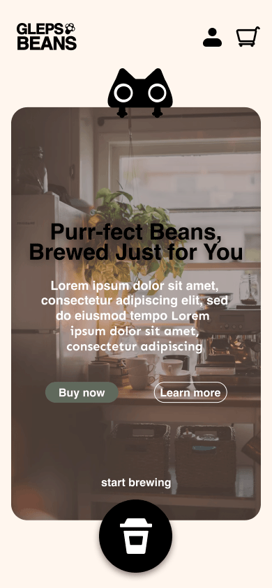
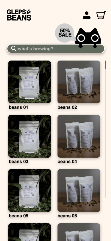
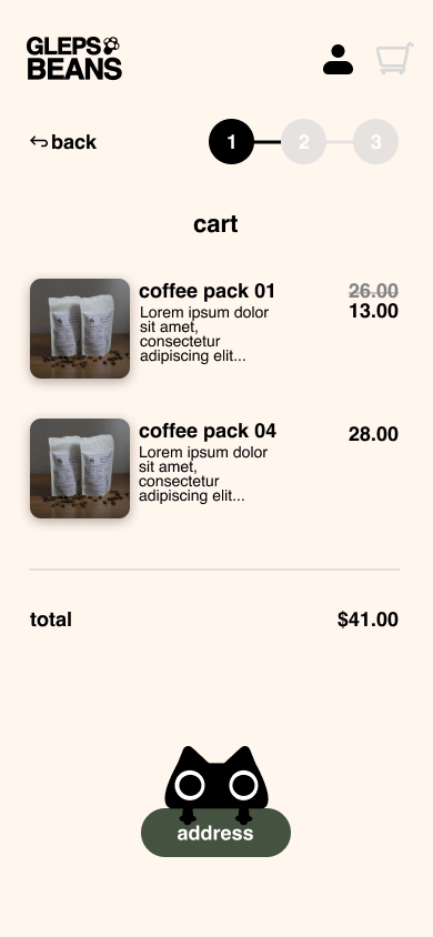
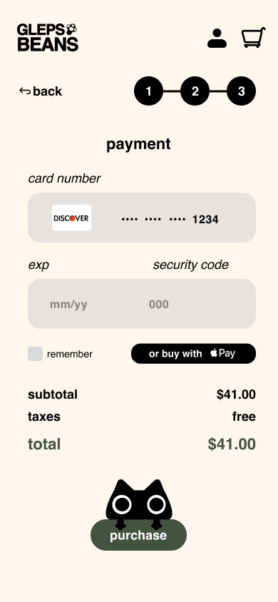
gleps beans
wave2earth website


